Envelope Color Psychology

You’ve probably heard more than once that colors affect moods. They can make you happy or sad, excited or calm. For direct marketing, that means that the color of your envelope can impact whether the person opens the mail and how receptive they are to what’s inside. If you’ve never thought about envelope color psychology, you should consider it as you design your next campaign.
It’s critical to create an eye catching design for your direct mail, including font, message and other details. However, it is the color of your envelope that will get noticed first, whether you’re using professional letters or handwritten letters. Don’t overlook the importance of choosing the best color if you want the right response from your recipients.
Here are some common associations people have with various envelope color options:
· Red creates excitement. It has the image of danger or the idea of a thrill. It can also relay the feeling of warmth. If you want to grab the attention of your recipient, red will do it. It can cause you to make an impulsive decision which could be perfect if you are looking for someone to sell their home quickly!
· Blue is a cool color, which is often calming. It can improve concentration, which is important if you want your recipient to think about their decision. Even though the color can be associated with sadness, it also has the meaning of trust and peacefulness. It can connect you with your audience. You want to make sure the seller trusts you so a blue envelope can get you started on the right foot.
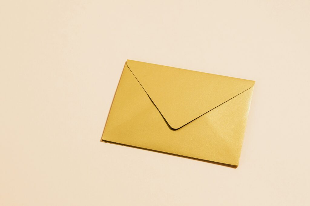
· Yellow is a happy color. It also inspires feelings of confidence and energy. Think of kids and their enthusiasm for life. The color also is used as a highlighter because it gets attention. It is a great option for the summer months because it is bold and fun.
· Orange is the color of creativity. It’s a combination of red and yellow without being as much “in your face.” It creates a feeling of warmth. Our Orange Quatrefoil is an investor favorite because it gives just the right amount of excitement to the letter.
· Green is the color of nature and life. It’s often used in organic products, but it’s also representative of money and wealth. Wealth is a positive aspect to tap into for both the investor and the seller so green is always a promising go to for envelope style!
· Gray is a neutral that often adds more interest than plain white. It’s also a professional shade that is contemporary and versatile. It can be elegant or casual, sophisticated or simple to fit your style.
Insider tip: Base your campaign color scheme on the time of year or holidays. For example if you are mailing in the winter around the holiday use the red envelope to bring the Christmas cheer. If you are mailing around Halloween, use orange to get in the Halloween spirit! People will appreciate the extra effort to stay with the season.
Now that you know what different colors mean, you can enhance your direct mail campaigns by choosing different colors that fit your message. If you want to know more about using colored envelopes or to create a campaign with color, contact Open Letter Marketing at 978-269-0245 or info@openlettermarketing.com.


